Automatic Dark Mode Colors Don’t Work
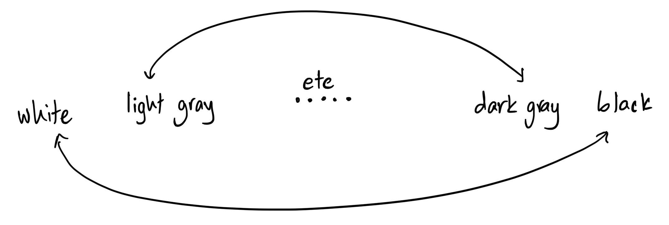
When building dark mode into a website, it’s tempting to invert the gray color scale across the site. Everything that’s white becomes black, and the in-between shades flip.

This makes sense: light gray text on a white background (barely visible, de-emphasized text) becomes dark gray on a black background (similarly de-emphasized!).
But when these shades of gray are being used elsewhere in the app, this simple flip stops working.
Here’s a fairly standard login page. It’s a small page, so we’re concentrating the content in a small card in the middle of the screen. There’s some secondary content, like a link to the “forgot password” page, so we’ve added a second card underneath for that.

Generally, lighter elements feel closer to us and darker objects feel further away. So we’ve made the main card lighter than the background, and the secondary little card darker to emphasize that it’s not the main focus of the page. We want the viewer’s eye to be drawn to the white card, and only to the smaller card below if they’re searching for more things on the page.
If we just flip the gray colors for dark mode, this is what we end up with:

The hierarchy feels weird. The main card is completely black (since it used to be white) and feels like it’s sinking into the background, trying not to be seen. The secondary card underneath is the lightest element, and your eye is immediately drawn to it even though it’s the least important part of the interface.
Unfortunately, I think the solution is to hand-assign each element’s color separately for light and dark mode.
The right shade of gray needs to be chosen twice to make sure it’s still producing the intended effect in its context. The shortcut of globally flipping the color scale doesn’t quite work.